Domain shift & Data strategy
tl;dr
- Clear problem statements are half the battle. Well-defined usecases obviate data requirements. Without this, my experimentation was going to fail.
- Data makes a big difference (duh!). By selecting the right data alone I saw performance improvements by 2 OOM. Tweaking training parameters got me to the target benchmark.
- Data curation is simple, not easy. Sourcing, annotating, and processing data is a grind but its the most important task and where HITL matters most.
- Clear outcomes flow from controlled variables. Trying a bunch of things is the best way to know what does/doesn’t work. But changing one variable at a time draws a line between input changes and performance.
- Opensource: The full source, notebooks, and scripts are available on GitHub.
| Before | After |
|---|---|
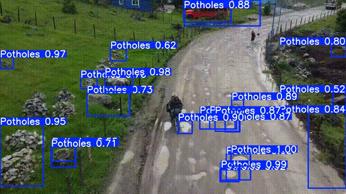 |
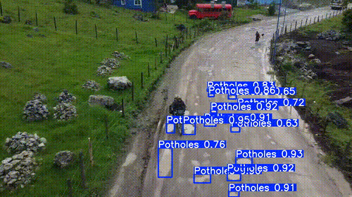 |
Where do we begin?
Last month I decided to train a computer vision model. It was super easy and fun, but didn’t net the best results. There’s a full write up here, but the gist of it is that I didn’t really start with the end in mind, and I discovered the importance of data strategy for ML applications.
On the heels of that flop my intention was to take on a more thoughtful approach to the notion that data strategy is the difference between a cvis model that works and mine.
So as to not leave any loose threads from my last post (and to have fun things to do over the long thanksgiving weekend) I set out to solve my domain shift problem by:
- Defining a clear usecase to serve as a ‘what’ and ‘why’ anchor for my experimentation.
- Decide on a success metric for this usecase that will provide an objective measurement on performance.
- Cultivate and prepare relevant training data in support of my usecase.
- Train some models to check their performance on my usecase.
- Draw some conclusions on what got me to (or kept me from) achieving the success criteria.
Like all things, this seems simple on the surface, but required navigating a lot of nuance in domains I’m not that familiar with (see Dunning-Kruger effect).
We’ll start at the beginning.
Defining a clear use case
Last time I was so gung ho to train a model that I skipped over the most important part: Defining the problem
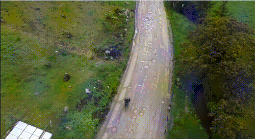
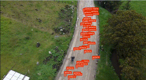
I needed to take a step back from the ‘how’ and lean into the ‘what’. My previous model faceplanted when running inference on overhead footage of a dirt road. That’s a pretty narrow failure condition so it felt like a good starting point.
In ML this is typically referred to as the “operational design domain” which defines a set of conditions under which the system is meant to operate. For simplicity, I’ll refer to it as a problem definition or use case.
In the real world I would want to validate and ‘harden’ this problem definition with user research and data, but under my current constraints (low budget, no commercial ambitions), this is sufficient. That said, I don’t want to understate the importance of this part. I think it’s the most important part of achieving success on this type of project (maybe all projects).
So I’ve got my target. Usecase (ODD): Detect potholes from overhead view on dirt roads with little traffic.
Now that I know what problem I want to solve, I’ll need a metric to tell me when I’ve solved it.
Deciding on a benchmark
Determining whether or not the model is performant seems trivial: Either it detects the potholes under the stated conditions or it doesnt, right?
Kinda… but there’s a couple of questions that need answers:
- What measure signals success?
- mAP (mean average precision) is a standard metric in object detection that balances recall (finding all the objects) with precision (avoiding all the non-objects).
- Its a measure of how well the model detects objects when compared to the real object boundary (this blog gets into some of the math behind how its calculated).
- I’ll be using mAP50 as my measure for performance. Its a pretty lenient metric, but still gives clear signal on whether or not the right object is being detected.
- What threshold is sufficient?
- Stated differently: “If mAP50 is the test, what score must the model achieve to prove its ability?”
- I’m trying to prove traction towards a solution, not achieve perfection on the first try. I think a
mAP50=50%sufficiently demonstrates utility while leaving lots of room for improvement.
The metric (mAP50) and threshold (50%) I chose both depend on validating performance on images with real potholes already identified (ground truth). Running these metrics against the irrelevant test data would yield useless results.
I’ll need to manually tag some images with potholes which begs the question:
What is a pothole?
- Definition: a depression or hollow in a road surface caused by wear or sinking.
- For the sake of this experiment I made some convenient assumptions:
- All road defects are potholes. Ground defects (off road) are not potholes.
- All puddles are potholes (but not the inverse).
- Potholes can be uniquely shaped (not just circular).
I used roboflow to pull frames from the video that caused my original model to fail and manually annotated ~1500 potholes to become my ground truth dataset. I’ll benchmark all the models I train against this ground truth set to draw a clear conclusion on how well we’re addressing the problem.
Now that I’ve got a KPI to target we can talk data that’ll get us there.
Data strategy
With a clear problem statement the data required is obvious: I need overhead images of dirt roads with potholes.
| This | Not This |
|---|---|
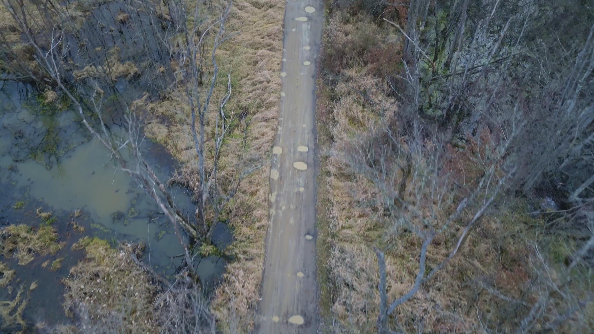 |
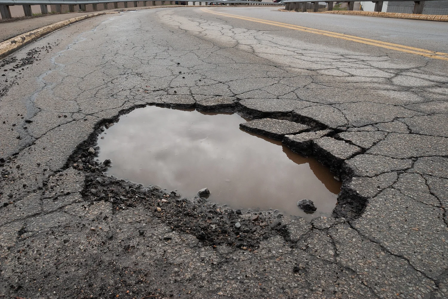 |
Again, this seems simple but there are nuances to manage:
- Dirt roads look differently at different times of day.
- The landscape around the roads can be dramatically different.
- Weather conditions play a role in how the road itself looks (e.g. snow covered)
- Potholes look differently at different overhead distances and angles.
- View of road can be partially obstructed by natural elements, like trees.
I’ll need to source training data that adequately represents this intra-class variance.
I expected to find public-license datasets that matched my usecase, but I was met with a-whole-lotta-nothing. I decided the best path forward would be to source my own training data.
For this experiment I followed the following constraints:
- Ethically sourced: Ethics in data matters. I wanted to make sure the data I curated was ethically sourced. This is not a commercial pursuit, so I leaned on fair-use.
- Hybrid data: I wanted to mix real and synthetic data. I used Pexels for royalty-free stock footage and Veo 3 for some synthetic training examples.
- Highly curated: I have limited bandwidth so I’m prioritizing quality>quantity. I cherry picked material that represented the nuance sufficiently, but didn’t go beyond that.
I decided on 1 img per second of video. This approach got me to a final count of 215 images covering the full spectrum of variance mentioned earlier (~550 after augmentation). This is a good start, but these are just raw images. I still need to turn this collection into a labeled dataset.
Preparing the data
Turning these 550 images into a real dataset that can be used for fine tuning was a grind.
Roboflow made this as painless as possible, but manually selecting each individual pothole was tedious to say the least. I tried using a SOTA model (SAM3) to do the labeling for me, but found that the model struggled to identify ‘pothole’ from these images (maybe my model will fill a real gap in the pothole identifying marketplace).
Armed with my ‘pothole’ definition from earlier I got to tagging and bucketing images between train/valid.
Once complete, I uploaded the dataset to Kaggle so that I could pass it into my colab notebook with the scaffolding I already have in place (and so others can follow along).
We’re ready to start training and tweaking models!
Running experiments
Alright! I have a problem to solve, a KPI to target, and a dataset that I’m hoping will get me there. Lets get into it!
This is the loop I generally followed. It didn’t always flow linearly, but for the most part I changed 1 variable at a time to get clear signal on what was affecting the mAP results:
- Make an assumption.
- Change a training variable to test that assumption.
- Train a model with those variables.
- Benchmark it on new dataset & record outcome.
- Come to a conclusion & start over.
To get 1:1 comparisons across different models I made some tweaks to the open-source colab notebook I’m using. These changes let me add validation without changing the existing training/inference scripts:
- Pick which model to validate & where to save results
- Download new dataset and select
testpath - Run validation on the test images & store results
- note: thanks to @ultralytics for this write up which helped a lot
(I’m about to get into the deets, but you can skip to the summary table if you’re impatient)
Control group
First up I had to establish a baseline. I started with the models from the previous experiment (trained on the ground-level pothole dataset) and ran them against the aerial-view pothole test images.
- Assumption: I’m expecting these models to perform poorly. They’re specialized for ground-level potholes but don’t generalize well to aerial view (“domain shift”)
- Result:
| Model | mAP50 |
|---|---|
| Control_1e | 0.45% |
| Control_20e | 0.42% |
- Conclusion: These two models were trained on the original ground-level dataset. They perform as poorly as I expected them to.
This effectively establishes a floor for how bad a model can perform. Any notable improvement to these scores is worth exploring.
Aerial_1e
My assumption is that the control models’ performance (or lack of) is the result of domain shift. I swapped out the training data and ran a short training on the new dataset.
- Assumption: Control models suffer from domain shift. Training on relevant data should net significant improvement.
- Variable: New aerial pothole training data
- Results:
| Model | mAP50 |
|---|---|
| Aerial_1e | 10.2% |
- Conclusion: This is a major improvement from baseline, though it comes far short of the 50% threshold. And we were able to achieve this with a relatively small dataset.
This is clear signal that relevant data matters. In my opinion, this confirms domain-shift as the key failure of the control models.
Aerial_20e
Domain shift is confirmed. My model Aerial_1e model is showing signs of life (and an ability to detect some potholes). I think the next step is to just crank up the training time and see where that gets us.
- Assumption: Previous training seems to confirm that we have the right data. Extending the training should specialize the model further and improve performance.
- Variable: 20 Epochs
- Results:
| Model | mAP50 |
|---|---|
| Aerial_20e | 42.9% |
- Conclusion: Nice! Another major improvement with a relatively short training run. IMO this proves that data strategy is the difference maker.
This model performs pretty well and comes very close to the threshold metric, but still comes just shy of it. I also note that for 20x the training the mAP50 improved by 4x, so there’s some diminishing returns on training time. This is commonly referred to as convergence and signals that the model is stabilizing and won’t significantly improve with more training.
Aerial_350e
We know we’re training on the right data but still falling short of the 50% target. Earlier I noted that the relationship between training time and mAP were non-linear but I don’t think we’re at the upper bound yet. We’re on to something that works so lets find the limit.
- Assumption: There’s diminishing returns on training time so I’ll have to extend the training by a lot to get all I can from the model.
- Variable: 350 Epochs
- Results:
| Model | mAP50 |
|---|---|
| Aerial_350e | 50.4% |
- Conclusion: WOW! It worked.. After a 2h training and battling Colab limits we passed the target benchmark by a hair. This was a 17% improvement against Aerial_20e which also confirms the diminishing returns concept.
I’m blown away that I was able to hit the 50% mark. I didn’t have high hopes. Its far from ‘production grade’ but this is a legit proof of concept model for its very specific intended purpose!
Roboflow_Aerial_350e
I hit my target (50%) and that feels like the upper limit of what I can achieve with such a simple setup and a free Colab GPU.
The default settings in my notebook were likely leaving some performance on the table. I came across this Roboflow article on their implementation of hyper parameter tuning and how it can maximize performance with no setup on my end.
- Assumption: Default hyperparameters are good-enough, but hyper parameter tuning will yield better results for the same inputs.
- Variable: Training with Roboflow (instead of Colab)
- Results:
| Model | mAP50 |
|---|---|
| Roboflow_Aerial_350e | 57% |
- Conclusion: Optimization matters! 13% improvement for the same training epochs. Negligible setup compared to colab.
This part of the experiment taught me a few lessons.
- First off, optimzation makes a big difference.
- Second, this took almost no setup, cost $0, and took around half the training time (~1h). Comparing to the effort to manually setup, maintain, and expand my notebook, this was a walk in the park.
- Finally, if a SOTA training harness only gets us to mAP50=57% then its fair to assume that getting to production-grade is just not in the cards with the current dataset.
Enter SAM3
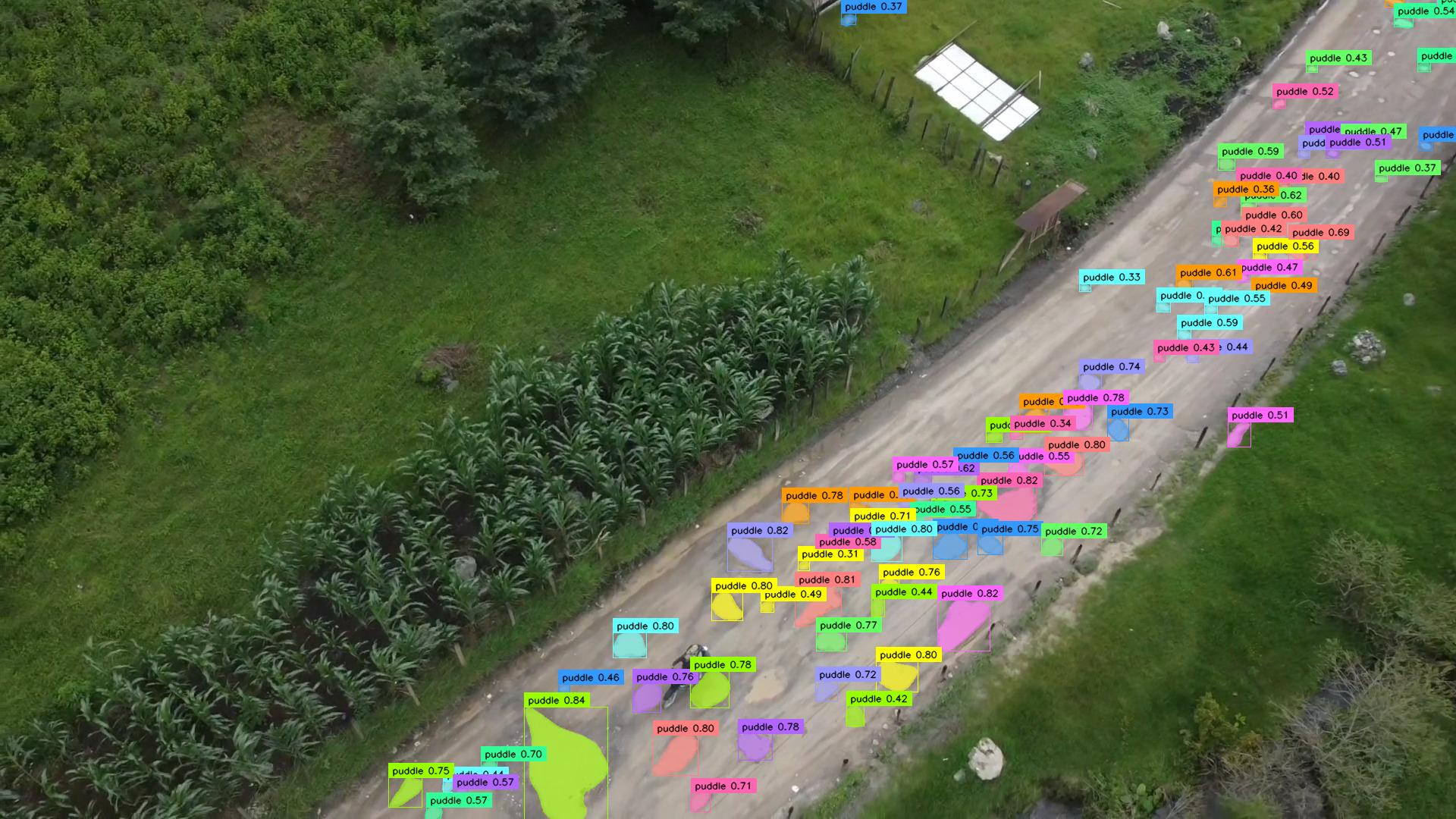
While I was running and documenting the above experiments Meta released their latest ‘Segment Anything Model’ SAM 3. Meta’s SAM 3 is a new SOTA model thats capable of detecting (and masking) objects based just on language inputs.
In theory, I should be able to just ask SAM 3 to identify “potholes” (or “puddles”) and it will return image/video with a perfect polygon around each pothole.
The demo app is impressive. On first glance it looks like it could perform really well relative to my custom models, but SAM 3 totally flopped when i tried to use it for labeling.
I wanted to put it to the test and see how it compared.
- Assumption: Huge SOTA model should just work. Built for ‘zero shot’ prompting with just text and no examples. I think it’s going to perform far better than my custom models.
- Testing:
- I wrote a script to run inference on my test data using “Pothole” as the prompt.
- Comparing It returns polygons in the same format as the custom models.
- Calculating mAP from these requires some polygon math (intersection over union) that I couldn’t get into.
- I decided to go with a count of objects as a gut-check metric for success.
- I had to prompt using “puddle” for SAM 3 to return something useful.
- Result:
| Model | Confidence | Object Count | % Accuracy |
|---|---|---|---|
| Aerial Dataset | – | 1444 | – |
| meta/sam3 | 50% | 558 | 38.6% |
| meta/sam3 | 25% | 1142 | 79.1% |
- Conclusion: This was a blowout in terms of identifying the objects I was interested in. SAM 3 was much slower, but that was expected. It got even better with confidence tuning.
| 50% Conf | 25% Conf |
|---|---|
 |
 |
From a model to model perspective its kind of apples:oranges comparison. SAM 3 was much slower than the YOLO models, but that was expected. But in terms of identifying the objects I wanted, SAM 3 was a big winner.
Overall, SAM 3 got insanely close to the ground truth objects that were manually labeled. Color me impressed.
| Ground Truth | SAM 3 @ 25% Conf |
|---|---|
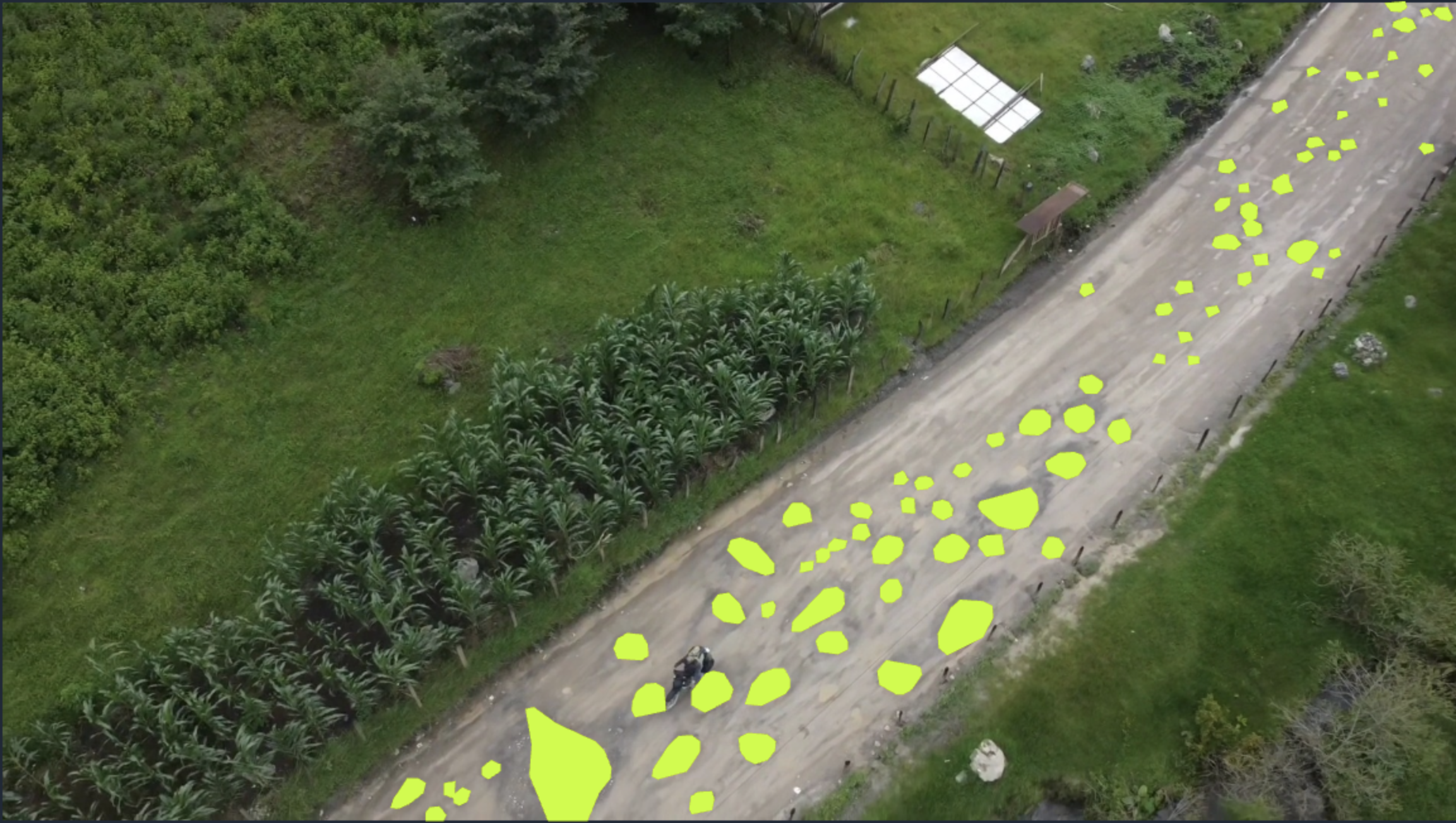 |
 |
Summary Table
| # | Model | Assumption | Dataset | Epochs | Result (mAP50) | Observation | Conclusion |
|---|---|---|---|---|---|---|---|
| 0 | Control_1e | – | Street-level potholes | 1 | 0.45% | Model fails on aerial images | Baseline |
| 1 | Control_20e | More training on same data will correct domain shift | Street-level potholes | 20 | 0.42% | Model fails on aerial images. Underperforms baseline | Rejected |
| 2 | Aerial_1e | Training on images more releavnt to the test case will correct domain shift | Aerial view potholes | 1 | 10.2% | Significantly outperforms basilne (2.2 OOM) but falls well short of benchmark (50%) | Supported |
| 3 | Aerial_20e | More training on same data will improve model performance | Aerial view potholes | 20 | 42.9% | Big performance improvement (4.2x). Tracking towards benchmark but still falls short. Training time relates to performance non-linearly | Supported |
| 4 | Aerial_350e | A long training run will yield better performance but a reduced rate. | Aerial view potholes | 350 | 50.4% | Achieves benchmark! Notable improvement (17%) | Supported |
| 5 | RoboflowAerial_350e | Prod grade training will yield better performance | Aerial view potholes | 350 | 57% | Notable improvement (13%) vs hyper parameter defaults | Supported |
| 6 | meta/SAM3 | SOTA model will achieve 50% benchmark with no fine-tuning on domain data | Aerial view potholes | – | – | Detects ~79% of the potholes. | Supported |
Conclusion
So now what? I started with a yolo model that didn’t work, and I was able to design and implement a data strategy to make it work.
That’s a fun experiment, but what conclusions do we draw:
- Data makes the difference. This is obvious in hindsight, but worth repeating and extends beyond cvis. No training tweaks were going to fix the original control models.
- The law of diminishing returns. Performance gains were huge early on but plateaued quickly. When that happens “more training” stops being a viable strategy.
- Controlled experiments. By changing few variables at a time the cause/effect relationship between the changes and the performance were obvious.
- SAM 3 is a game changer. There’s some big-time tradeoffs to using SAM3 in terms of speed, so it might not be ideal for real-time. But nearly eclipsing my modles right off-the-shelf with zero examples is next level for cvis.
I took <5 min of drone footage and turned it into a working POC in just a few hours. This was an all out success that I wasn’t expecting.
- Earnestly thought through the type of images and conditions that would make this model successful for the use-case (and published a dataset).
- Surpassed my target metric (50%) after only 3 model iterations, landing at
mAP50=57%(I literally jumped with excitement!). - Experimented with Meta’s new SAM 3 and built out a validation harness to map its inference output to YOLO labels (opensourced here)
This one was a lot of fun. Thanks for reading!
Nick M.